
McKinsey Analytics Online Hackathon
Over the weekend, I joined my first hackathon organized by McKinsey and hosted on AnalyticsVidhya. The hackathon was over a 24-hour period starting from 11am AEST Saturday and finishing the next day. The event itself was a hiring hack and includes the prize of an all-expense paid trip to any international analytics conference of choie as a McKinsey guest.
To be honest, I don’t remember how I found out about this event but I just signed up without thinking much and was not really planning on participating as I knew my weekend was full. Initially, the thought was just to see what kind of problem would be presented.
This post will focus on junction 1 (one of four junctions) and describe the thinking at that time. During the event, a lot of time was spent exploring the data before even beginning to model. The steps here are definitely not optimal as time was very limited, so the initial focus was to be able to output a realistic result and see how it ranks.
Jumping onto the site after a lunch engagement, the problem was as below.
Problem Statement
Mission
You are working with the government to transform your city into a smart city. The vision is to convert it into a digital and intelligent city to improve the efficiency of services for the citizens. One of the problems faced by the government is traffic. You are a data scientist working to manage the traffic of the city better and to provide input on infrastructure planning for the future.
The government wants to implement a robust traffic system for the city by being prepared for traffic peaks. They want to understand the traffic patterns of the four junctions of the city. Traffic patterns on holidays, as well as on various other occasions during the year, differ from normal working days. This is important to take into account for your forecasting.
Your task
To predict traffic patterns in each of these four junctions for the next 4 months. Time to apply your data science skills. Good luck!
Seeing the words predict definitely got me going so I peeked at the train dateset.
DateTime,Junction,Vehicles,ID
2015-11-01 00:00:00,1,15,20151101001
2015-11-01 01:00:00,1,13,20151101011
2015-11-01 02:00:00,1,10,20151101021
2015-11-01 03:00:00,1,7,20151101031
2015-11-01 00:00:00,2,15,20151101001
2015-11-01 01:00:00,2,13,20151101011
2015-11-01 02:00:00,2,10,20151101021
2015-11-01 03:00:00,2,7,20151101031
2015-11-01 00:00:00,3,15,20151101001
2015-11-01 01:00:00,3,13,20151101011
2015-11-01 02:00:00,3,10,20151101021
2015-11-01 03:00:00,3,7,20151101031
2015-11-01 00:00:00,4,15,20151101001
2015-11-01 01:00:00,4,13,20151101011
2015-11-01 02:00:00,4,10,20151101021
2015-11-01 03:00:00,4,7,20151101031
...
And here is a snippet of the test dataset.
DateTime,Junction,ID
2017-07-01 00:00:00,1,20170701001
2017-07-01 01:00:00,1,20170701011
2017-07-01 00:00:00,2,20170701001
2017-07-01 01:00:00,2,20170701011
2017-07-01 00:00:00,3,20170701001
2017-07-01 01:00:00,3,20170701011
2017-07-01 00:00:00,4,20170701001
2017-07-01 01:00:00,4,20170701011
...
Ooh! Time-series data! This got me really excited, considering that I have time until my dinner engangement, I fired up RStudio. Drawing from my experience, this could go two ways either similar to share/forex prices (stochastic) or similar to building energy data (pattern based on hour of day, day of week etc.).
Looking at the data itself, the following is obvious:
- ID is just a concatenation of the date, hour and junction
- The only features seems to be the date and time
Based on the rules, we are not to infer any other type of information outside of the given dataset, i.e. don’t assume holidays which are country specific.
Exploratory Data Analysis
Data Wrangling
After reading in the data, first was to make the junctions as a factor so that the data can be split into 4 different dataframes. Next, convert datetime strings to POSIX using the lubridate package, the time series features are extracted using the tk_augment_time_series() from the package timetk (previously known as timekit). The functions extracts so many different layers of information from the datetime string. This should be followed by the usual str() and summary() to review the data.
Before we proceed it is important to keep in mind that just because the data contains timestamps, does not necessarily mean it is the correct timestamp. The timestamp could be in UTC where the data was collected in another part of the world, e.g. times of midnight and midday does not correlate with the data. This is sometimes the case when working with time series data. However, for this hackathon, this was ignored and the datetime is just considered as a continuous variable.
# separate data into junctions
dfjunc <- lapply( levels(traindata$Junction), function(k){
                  traindata[ which(traindata$Junction == k ) ,]} )
dfjunc <- setNames(dfjunc, seq(1,4) )

# format datetime and extract information
dfjunc$'1'$DateTime <- ymd_hms(dfjunc$'1'$DateTime)
dfjunc1 <- tk_augment_timeseries_signature(dfjunc$`1`)

names(dfjunc1)

[1] "DateTime"  "Junction"  "Vehicles"  "ID"        "date"
[6] "index.num" "diff"      "year"      "year.iso"  "half"
[11]"quarter"   "month"     "month.xts" "month.lbl" "day"
[16]"hour"      "minute"    "second"    "hour12"    "am.pm"
[21]"wday"      "wday.xts"  "wday.lbl"  "mday"      "qday"
[26]"yday"      "mweek"     "week"      "week.iso"  "week2"
[31]"week3"     "week4"     "mday7"
Analysis
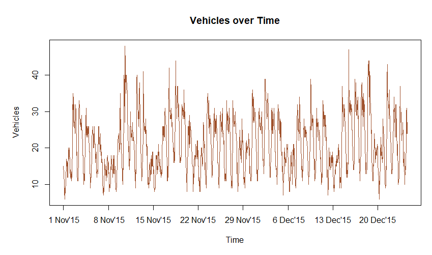
Look at all the features extracted just from the datetime string. Next up was plotting the time series data itself.
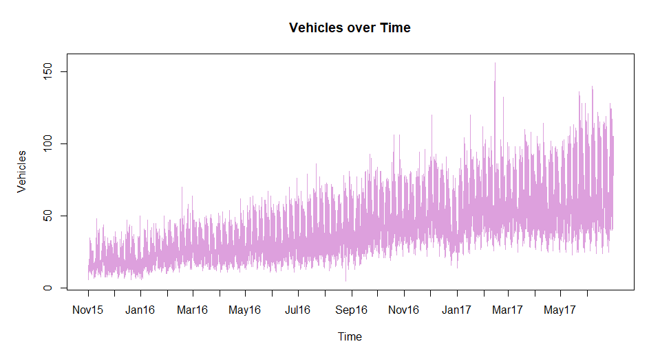
From here, I noted the shape of traffic daily and there seems to be a pattern for different days of the week. This intuition is something I picked up from my previous role working with building energy consumption, however, the additional feature in that data was the outside air temperature. Essentially, with this data, if we were to plot a 3-dimensional surface, the x and y axes would be hour of day and increasing time (which can be represented by POSIX time in the index.num column) with the dependent variable being number of vehicles.
Note the following:
- increasing trend over time (maybe population growth? cheap car loans? cheap cars?)
- some spikes at points (possibly other road closures?)
- a dip over the christmas and new year period in 2017 (interestingly 2016 had a barely noticeable effect)
Before continuing here, I opened another file in the editor called pipeline.R and started thinking about the pipeline. Building processes as we go along is the best way to make sure it is documented and ideas are not forgotten or lost. It also makes it easy to go back and iterate on the solution.
Start the pipeline with a simple flow:
Initialize » Read data » Data wrangling » …
As we understand the data in EDA (exploratory data analysis), we can update this file either with code or just with simple comments.
Moving on, I plotted some boxplots across the hours, days of the week and day of months.

Note the outliers from the boxplots. It is expected to have outliers at the top where the traffic does spike but for the bottom part which we observe for christmas and new year, it is not observable since it is mixed with other data.
At this point, it did not seem that the boxplots provided much value since they do not provide a better view of the data. Just looking at hours between 10am and 7pm from the “Hour of day” figure, it is easy to understand that since the data is increasing over time, even the outliers are possibly just data at the later end of the time scale.
An interesting point to note is the small range of data in the early hours of the morning, suggesting that despite a large increase during the day the traffic at this hour has not significantly increased.
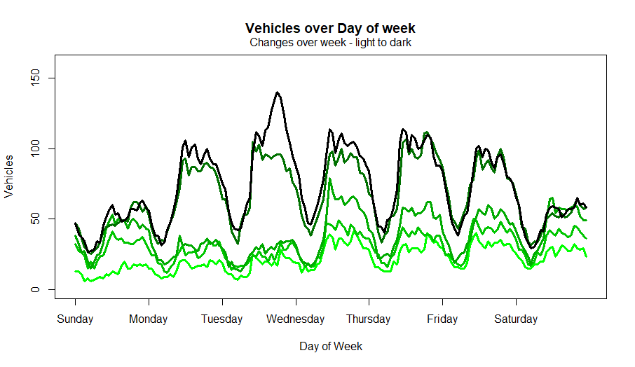
The plot of change over week describe the intuition at the time.
Note the plot below was created post event to explain this better
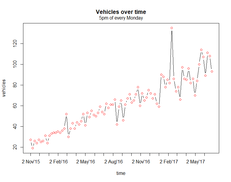
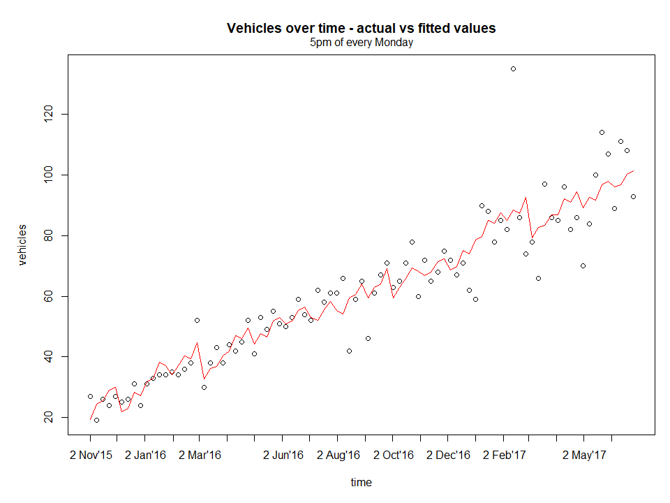
Progressing further and to confirm the intuition, I stepped through the hours of every weekday. The plot below shows the vehicles over time for every 5pm of every Monday.
Model fit
It is immediately obvious that the data is almost linear here. It would be easy to model at this granularity, so model and look at residual without forgetting to remove unnecessary columns that are not continuous variables such as labels and repetitive values ( e.g. wday and wday.xts).
Normally at this point, I would look at variable correlations prior to building a model but in the moment, I had limited time and wanted to get at least one submission in. The priority here was to think about the pipeline to make it easy to iterate. So, I made a note and if I had time, I would come back to it.
Next, to assess the residuals, create the figure below.
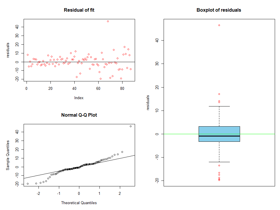
It is clear that there are several outliers from the model. This could easily be as a result of a poor model which is known to be the case since the features were not assessed properly. Refocusing again on the pipeline, proceed to create some filters to remove the outliers so that when we come back, this would already be automated.
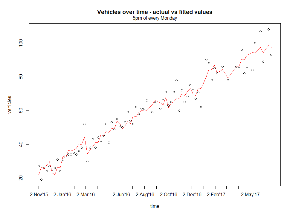
This looks better, now assess residuals.
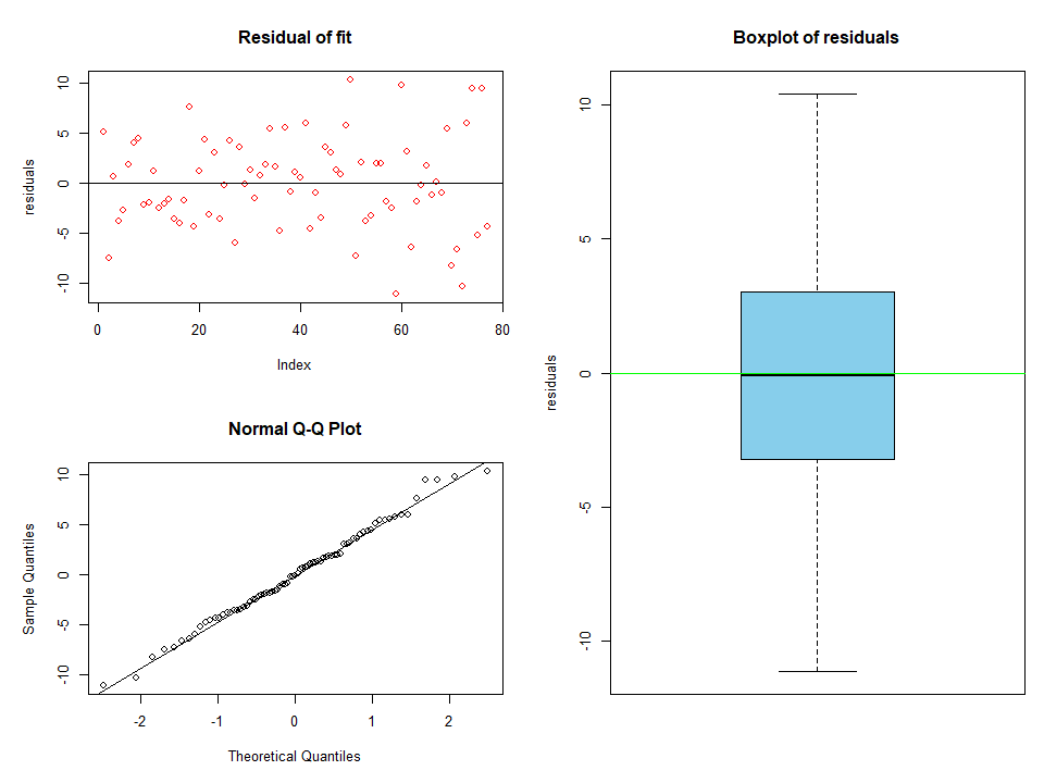
All the outliers have been removed. The data looks to be normally distributed too from the QQ plots with a mean centred around zero and there was no trend leftover, i.e. not captured by the model, since we see a random scatter.
It would be great if there was more time for:
- investigate residuals’ independence as an estimate that the error terms are independent - no reletionship with prediced values or predictors
- check for constant variance - from the QQ plots, it does seem this is the case.
Now compare the fit and prediction of both, with and without outliers.
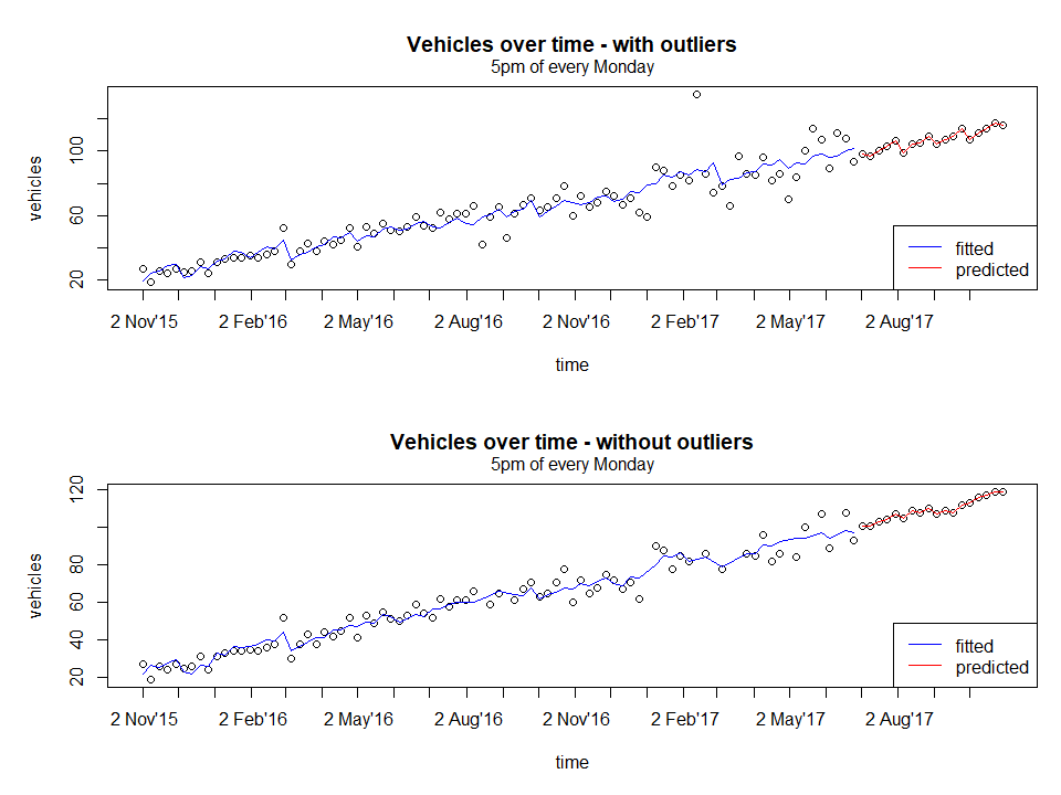
From a quick glance, both the fitted curve looks similar, but on closer inspection, the areas where outliers have been removed such as around 2nd August 2016 and 2nd Feb 2017 has a slightly better fit (smoother but this is subjective).
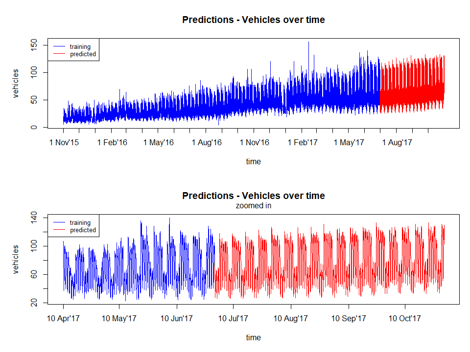
Finally, after analyzing all the junctions, proceed to predict the entire data set.
Predicting the entire data set
Below is the main part of pipeline.R used to run the predictions.
junclist <- seq_along(dftrain)
wdaylist <- seq_along(unique(dftrain$junc1[,"wday"]))
hourlist <- seq(0,max(dftrain$junc1[,"hour"]))   #list starts from 0

# iterate over list of junctions
juncoutput=list()
for( junc in junclist){

    train <- dftrain[[junc]]
    test <- dftest[[junc]]

    # iterate over each day of week
    dayoutput=list()
    for(day in wdaylist ){

        # iterate over each hour of day
        result = list()
        for(hour in hourlist ){

            # filter training data based on hour and day
            cond_hour <- train[,"hour"] == hour
            cond_day <- train[,"wday"] == day
            condtrain <- cond_day & cond_hour

            chunktrain <- train[ which(condtrain),] %>% rmcolm()

            # filter test data based on hour and data
            cond_hour <- test[,"hour"] == hour
            cond_day <- test[,"wday"] == day
            condtest <- cond_day & cond_hour

            chunktest <- test[ which(condtest),] %>% rmcolm()

            if( dim(chunktrain)[1] == 0 | dim(chunktest)[1] == 0){
                cat( "[+] junc:", junc, "  day:", day, "  hour:", hour, "\t SKIPPED\n")
            #     cat( "\t\t\t\t", dim(chunktrain), "\n")
            #     cat( "\t\t\t\t", dim(chunktest), "\n")
                next
            }

            # fit and predict
            fit <- lm(Vehicles~. , data=chunktrain)
            # fit <- ranger( Vehicles~., data=chunktrain,
            #                num.trees=200,
            #                splitrule="extratrees",
            #                importance="impurity"  )

            chunktrain[,"residuals"] <- fit$residuals

            # remove outliers
            qqval <- quantile(chunktrain$residuals)
            qrange <- 1.5*IQR(chunktrain$residuals)
            cond1 <- chunktrain$residuals <= qqval[2]-qrange
            cond2 <- chunktrain$residuals >= qqval[4]+qrange
            cond_out <- cond1 | cond2
            if( length( which( cond_out)) > 0) {

                chunktrain <- chunktrain[ which( !cond1 & !cond2),] %>% select( -residuals)

                fit <- lm(Vehicles~. , data=chunktrain)
            }

            chunktest[,"Vehicles"] <- as.integer(predict( fit, chunktest))
            # chunktest[,"Vehicles"] <- as.integer(predict( fit, chunktest)$predictions)


            # compile output
            output1 <- chunktest[, c( "year", "month", "day","hour")]
            output2 <- as.data.frame( list( Vehicles=chunktest[, "Vehicles"]) )
            dummy <- as.data.frame(list( Junction=rep( junc, dim(output1)[1] )))
            result[[hour+1]] <- cbind( output1, dummy, output2)

        }
        dayoutput[[day]] <- do.call( "rbind", result)
    }
    juncoutput[[junc]] <- do.call( "rbind", dayoutput)
}
.
# merge result
final <- do.call( "rbind", juncoutput)
# recreate ID column
final[,"ID"] <- paste( final$year,
                       formatC( final$month, width=2, flag=0),
                       formatC( final$day, width=2, flag=0),
                       formatC( final$hour, width=2, flag=0),
                       final$Junction,
                       sep="")

# fail-safe to prevent negatives
final[which( final$Vehicles <0),"Vehicles"] <- 0

# any duplicates?
dupl <- dim(final[ which(duplicated(final$ID)),])[1] != 0
cat("\n\n[+] Any duplicates?   ->", dupl,"\n")

# predicted rows are the same as test df
eqrows <- nrow(dftestraw) == nrow(final)
cat("\n[+] Equal rows?         ->", eqrows, "\n\n")
Essentially the code looks at each junction and models at the level of hour of day and day of week. I am sure it is obvious that using for loops are not ideal and vectorized operations are preferred but this was a hackathon with limited time. Also, it helped me to step through the code as I was writing it without having to resort to global variables etc. If this was an actual project, it would obviously be converted to a function, especially the model call to make it easily changeable.
Result
The figure below shows the final results. The predicted values seems to be ok for a simple lm model without much feature engineering.
Other observations include the fact that the model captures:
- the overall increasing trend of the data
- the pattern of different weekdays
Below is a screenshot of the first submission which ranked 83 out of roughly 350 at the time. There are two scores since one is the public data and the leaderboard score was for the private data. It was not bad since the leader at the time had a score of about 5 (less is better - RMSE metric) and past the 100th place the scores were in the triple digits.

Unfortunately, if you go to the leaderboard now you will not find my name on it. Why? Due to the way the submissions works, you could submit as many times to check your results but you had to click on a different link (as in, located elsewhere) to do a final submission. This was to the dismay of many as I found out in Slack chat, in fact, even the leader with the score of 5 is also not on the list. At one point, the leaderboard grew to 550 participants.
What could have been done better?
- Better feature selection
- check the correlations between the predictors and removing low correlation features
- Better model selection
- arguably lm is okay but it is possible that other models may provide better fit
- Analysis of residuals
- check for independence and constant variance using statistical tests
- check for independence and constant variance using statistical tests
Questions
One question left over in my mind is, in this case, the modelling was done at the hour of day and day of week level, would modelling at the time series level with hour of day and day of week as predictors produce the same result? i.e. instead of looping through, just model at the high level. This would be an interesting investigation to understand modelling better.
What have I learned?
A lot but mostly pertaining to just being more efficient at looking at the data and building the pipelines. Generally, either during work or side-projects, I had more time to analyse the data thoroughly, selecting models and tuning parameters. It was also suprising that I was not ranked at the bottom as I initially expected, this may have been more to the fact that I have some experience working with time series data.
Now I understand why hackathons can be addictive, even doing one for a few hours really got my brain going.
All files can be found from my github github.com/amirmazmi/mckinseyhack2017